Tuesday, October 2, 2007

Studio Final: Concept Statement

The final Concept Statement: "Flowing Boston - Flowing Spaces" evolved during the intensive week from my desire to apply the principles of "Organic Architecture" (as in the architecture of Frank Lloyd Wright) to an urban retail environment. This was intended as a personal exploration of the applicability of these principles to what is - for me - a very different kind of design problem.

Through my research and apprenticeships, I have developed an understanding of Organic Architecture. In a term paper for a Modern Architecture History class, I developed my own concise list of the "Principles of Organic Architecture" which can be rationally applied to my own design process and which can also be used to critically analyze works of architecture. Quoting from my paper:

1. The Design should be for and of the Site. The unique site should be analyzed and experienced, allowing the design to be created from the inside spaces outward. All factors of the site should be considered, including solar orientation, topography, views, prevailing winds, sound/noise issues, and natural elements of the landscape. The design should take advantage of the sun for natural light and passive heat. The design should become part of the site, not something placed onto the site. The disruption of the natural elements of the landscape should be minimized.

2. The Design should Create Organic Spaces. Allow space and materials to flow around corners and from the inside to the outside. Organic Space continues beyond the corners and engages the imagination. Do not "trap space" by blocking that flow of space around corners or from inside to outside. 2(a). Inside is as outside. Allow the space and the materials to flow continuously from inside to outside and from outside to inside. Blur the line between inside and outside in order to "destroy the box" of confinement.

3. Part is to whole as whole is to part. Develop a language for the design. Choose an appropriate Unit System for the design in order to unify the design and reinforce that language. Limiting the pallet of materials can help establish this language of the design. Allow the materials to flow around corners and the materials and specific design elements and to repeat from space to space.

4. Form and Function are One. Allow the unique needs and conditions of the Client and the Site to inform and to drive your design. Create spaces which serve the individual needs of the client and which are create a wonderful, enriching experience for the occupants. Design for the Human Scale of the occupants. Allow the materials chosen for your to express their unique nature. Use materials to perform suitable functions for that particular material.

During discussions with Ted Galante, I was encouraged to narrow this list down, and to focus on the creation of "Organic Spaces". I would focus on not trapping space - or to state it in a positive manner - to allow space to flow. The final statement - "Flowing Boston - Flowing Space" was the result. As it turned out, I should have probably stuck to just flowing space as the flow of Boston concept is very different in nature than the flow of space and it was difficult to express the two very different kinds of flow in the design.


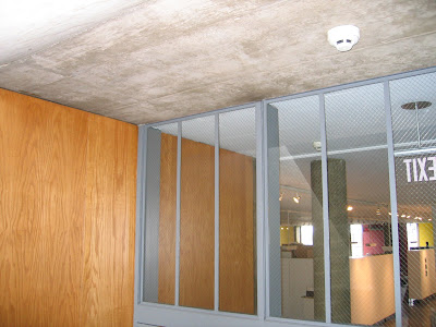
This image from Le Corbusier's Carpenter Center on the Harvard Campus shows the flow of space as executed by a master.

Studio Final: Research and Exploration

I have been thinking about the design decisions I have been making and how they relate to my overall concept.


The corner of my design breaks into the sidewalk at the street corner in response to a specific concern regarding the site. The corner site enjoys the benefit of being highly visible from Copely Square, the Library, from the West approach on Dartmouth and from the South approach on Boylston. However, the current building does not stand out or distinguish itself from the North on Boylston and especially from the East on Dartmouth. By allowing that part of the design to interact with the sidewalk slightly it announces itself to pedestrians on those routes. As the site plan below shows, the ground floor extends 12' onto a 38' wide sidewalk on Boylston and 4' onto the 24' wide sidewalk on Dartmouth. The upper floor decks extend further creating a sheltering overhang for the parts of the sidewalk and creating a "canopy of structure" for the entrances.


I have considered the "Flow of Boston" and its pedestrians. The video below illustrates the frenetic nature of that flow.


That flow is nothing like that of a gentle river. The flow of Boston is more like that of gas molecules in a balloon. People are constantly moving in every possible direction, alone or in small groups, somehow managing not to collide. A better comparison might be with a complex network, such as the internet, where people are moving in both directions along major arteries and minor ones. The circulation study below - pedestrian flow if the building were not there - had a strong influence on my design. I decided to move out of the way of the natural pedestrian flow. Perhaps it is a nod to Le Corbusier and his Carpenter Center that I have created a space where pedestrians can pass through the building and choose to either enter the building proper or not. This space between the two sections blurs the distinction between inside and outside and raises the question: when do you actually begin to inhabit the design?
As the sketch below shows, while the design does extend onto the sidewalk it does not block or significantly interfere the pedestrian flow, people on the sidewalk approaches are given a choice: to move though the building or to move beside it.
A massing study was the basis for with some structural development. Though that study I discovered some design elements - under consideration - were impractical or simply did not work. What makes this into a building is the further study: massing with glass. The massing is creating the structure and the glass is creating the envelope. The structure and the envelope combine to form a building. The interplay between figure-ground, solid-void, massive-light, and transparent-opaque begins to make building more interesting architecturally.

What does make a building a work of architecture? My original concept exploration might lead to some insight on my thinking. I wanted to create a work of Organic Architecture for retail sales in the busy Back Bay of Boston. Applying some key principles of Organic Architecture can be the basis for creation of architecture.

1) The Design should be for and of the Site. The unique site should be analyzed and experienced, allowing the design to be created from the inside spaces outward. By moving the building "out of the way" of pedestrian flow, by making the building more visible from all directions, by using urban materials of concrete and glass, I have addressed a specific site issues.

2) The Design should Create Organic Spaces. Organic Spaces allows space and materials to flow around corners and from the inside to the outside. Organic Space continues beyond the corners and engages the imagination: My vision for this design does this, building on the ideas of flowing space in plan and section as evidenced in the end-of-intensive presentation.


3) Part is to whole as whole is to part. Develop a language for the design. Allow the materials to flow around corners and the materials and specific design elements and to repeat from space to space: The 45 degree cut through the building started to suggest a language for this design. This continues to be expressed in massing and envelope development.

4) Form and Function are One. Allow the unique needs and conditions of the Client and the Site to inform and to drive your design. Allow the materials chosen for your to express their unique nature. This design is for a retail store - an Apple Store - which demands easy access from multiple area to multiple areas. I have used concrete for mass and glass for envelope in the nature of those materials.

Regarding the use of ramps or as the whole building as ramping floor plates, my study of the Le Corbusier and his Carpenter Center and Villa Savoye was enlightening and I now have a much greater appreciation for his designs. In both buildings mentioned he uses ramps as elegantly integrated, vertical circulation to move from a single level to the next. In the Carpenter Center the ramp allows access through the building (in a wonderful inside-outside space) from street to street. Otherwise the floor levels are essentially simple flat slabs accessed by stairs (and in the Carpenter Center, an elevator).

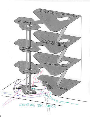
This design which does comes to mind when considering vertical circulation as a single, flowing, continuous floor is Wright’s Guggenheim Museum. While this arguably might be a great design for an art museum, it does not translate to a retail store. What I also realized doing circulation studies is that most customers do not have the need or desire to visit the entire store. The network of circulation in a retail store has to be just that, allowing easy access to any part of the store. Forcing a linear ramping circulation pattern onto the public would also not be in sync with my picture of the complex network of traffic patterns of Flowing Boston.

I see both vertical circulation areas as great light wells. I will either have skylights over these areas or possible glazed roofing, I have not yet worked out the roof details. Light will also wash down the North and East walls via "slots" in the floor slabs again entering though glazing at the roof level. This development of this concept is evident in my earlier section above.

Studio Final: Section

Again, these are as posted in Boston. Section A-A is a very simlified section showing the release of space and vertical light shafts created by pulling the floor plates away at the N (left) structural wall and how the floor plates either pierce the glazing at the S (right) or are pulled back from the glazing to allow the space to flow from floor to floor.
Section B-B shows the opening from floor to sky in the stair/light well. There is a similar condition in the elevator/light well.

Studio Final: Plan

These plans show the "flowing space" horizontally through the glazing at the massive structure and vertically at the structural North and East walls and at the stair/light well and elevator/light well.


Studio Final: Site and Roof Plan

As presented in Boston on Saturday


Wednesday, September 26, 2007

Studio Final: Model and Perspectives

Here is the model and the perspectives as presented in Boston. These show the inside-outside flow of space.


Tuesday, September 25, 2007

Model Progress

Here are a couple of images of the model in progress.
First some parts...


Then some assembly...


Saturday, September 22, 2007

A view in the site...

As I am working on the physical model and the packaging, I also am looking at some presentation views, and thought I would share this preliminary one...

Tuesday, September 18, 2007

Back on the Ground...

Over the weekend, I decided that the front part of the design needs to meet the ground despite the advantages stated in the earlier post. As Ted so astutely pointed out, this was "avoiding" the issues regarding how this should interact with the ground instead of working to resolve those issues. It was too easy just to remove the enclosure from the ground level. So I am back to working this out. These drawings show progress so far...

Friday, September 14, 2007

The Truncated Lozenge Progress

Some progress plans:
1st Floor:

2nd Floor:

3rd Floor:

4th Floor and Green Roof:
A view from the corner:

Snooze Alarm Inspiration & the Truncated Lozenge

It occurs to me... If I am trying to "get out of the way" of the "flow of Boston", why don't I create a design that really allows the flow as if the building were not there? If the smaller section did not come to the ground, it would really get out of the way. It would instead create a canopy of structure (I hope this isn't Eddie's umbrella), define the entrance, define passageways, create the arteries for the flow. The upper levels could take whatever form is most in keeping with the concept, without interfering at the pedestrian level. The sketch below shows several possible upper floor shapes, but I think the one that works best is Ted's "Truncated Lozenge". (in green) It will create visual interest from all directions, create implied indoor/outdoor spaces, and allow for more green space - bringing a little of the square into the corner perhaps - at the ground level.
This is a quick study of the approach from the library corner....
And from the North on Dartmouth...

Thursday, September 13, 2007

The lozenge...

Another attempt at the separated portion's form. The "lozenge" or "eye" shape works (but starts to create another "repellent corner") on the SE side but it blocks the subway entrance on the NW side... I will keep working on it.

Tuesday, September 11, 2007

Testing some design decisions

I have decided, before building this into the final presentation model, to test some of the design decisions so far and look to my cohort for some input.
I made the decision to cut the building in two at the ground floor level to allow the "Flow of Boston" to circulate through as if the building were not there. I did a quick sketch to try to get a feeling for occupying that space between the two parts of the building.


Cutting the building at a 45 degree angle did a few things. It freed the pedestrian flow as expected. It created two separate and unequal structures at the ground level and beyond. The smaller part has greater visibility and therefore importance where the larger part is more hidden, an interesting paradox. It also began to set up a geometrical language of 45 and 90 degree angles.

My first resolution for the form of both parts the building worked off of this now established relationship. This creates some strong forms which work with pedestrian flow and create an ordered expression. It steps into the sidewalk - the realm of the pedestrian - without being too oppressive. It serves to create some inviting exterior spaces and concave entrances to the pass-through.
I decided to look back to a couple of other options which were considered but rejected to see what everybody else thinks about them.

The first introduces a second geometry - a semicircle. This works to further differentiate the two different building parts formally, and it further softens the buildings "intrusion" into the pedestrian space. Do these two geometries conflict with each other too much or do they somehow work together to differentiate the parts and strengthen the whole?
I also considered a more of a "truncated square" approach, slicing parts out of the square form and shifting the smaller part of the building somewhat to interact with the pedestrian flow. This has strong formal continuity, and visually expresses the effect of the "slice". The weakness is that it presents a real "repellent corner" with its acute angles on the north and east approach. Do you think this factor is strong enough to reject this plan or does it deserve further study to soften that corner?
I would appreciate some thoughts on this - either to push me down my current path or to send me down a new one.

Friday, September 7, 2007

Intensive Photo

I found this cohort photo while looking for something else. It needed to be shared. I also uploaded it to Matt's FTP site if you would like a copy... It is IMG_5422.JPG in the Photos Directory.

Thursday, September 6, 2007

Massing with Glass

I have added a glass dominant envelope to the earlier massing to see what it would look like. (I think it looks a little like some kind of a bug from this view from the corner by the library)


This view is through the diagonal passage arising from the question in the circulation studies "if the building were not there" This seems to be the most significant design element which came about as a direct result of thinking about circulation.


Where this view is from sidewalk level approaching from the East on Boylston Street. This shows how the building engages the sidewalk area and announces itself from to people even on this approach.
I am still struggling with trying to incorporate some Le Corbusier principles into this project. I think that the influence which Frank Lloyd Wright has on me is so strong that it may be interfering with that process. However, I found a wonderful book today which may help me to better appreciate Le Corbusier. It is titled "Frank Lloyd Wright and Le Corbusier - The Great Dialog" by Thomas Doremus. Mr. Doremus contends that the two master's works while very different, are the results of many shared principles. For instance, he compares, and finds many similarities in, Fallingwater and Villa Savoie. Ted, were you making that same connection when you encouraged me to explore "Corb" and his Carpenter Center? Perhaps if I work to incorporate Wright's principles, I will be incorporating Le Corbusier's as well? I need to focus some energy on Theory Class now, perhaps that work will "cross-pollinate" into this project.

Wednesday, September 5, 2007

Massing

As I am struggling to incorporate something more from the circulation studies into my design... Thinking about Corbusier, ramps, articulating levels, but no breakthroughs so far...

I have started to look at the massing which I have in mind for the building. These SketchUp drawings are not nearly complete but they have given me a better idea of what this "mass and glass" building might look like. I know that the floor plates on the second and third floor need to be pulled away from the envelope in order to release the space.


Tuesday, September 4, 2007

Another Sketch and More Circulation

This is a new sketch looking through the inside-outside pass through part of the building. This sketch shows the multiple entry possibilities
This is the back of one of the circulation studies... I thought it looked just as good on the back!
These are the actual circulation studies. If they are not the full circuit of the store, the variation is noted.